

BankID - Redesigning for 7.5 million Swedes
ROLE: Lead UX Designer
MADE IN: The World Loves
CLIENT: Finansiell ID-teknik
DURATION: 6 months

METHODS: UX Analysis, User Flows, Sitemaps, User Stories, Templates, Wireframes, User Testing, Personas, Workshops
TOOLS: Axure, Keynote, Excel
BankID is an electronic identification and signature for digital devices. The BankID mobile app is among the most downloaded apps in Sweden with 7.5 million active users. BankID wanted to renew their digital services to be better adjusted for the broad variety of users in order to become more inclusive for all age groups. The makeover included the redesign of their mobile app and four separate web-based services. I was in leading the UX work for this critical project, working closely together with visual designers and clients technical team.

Defining the new direction
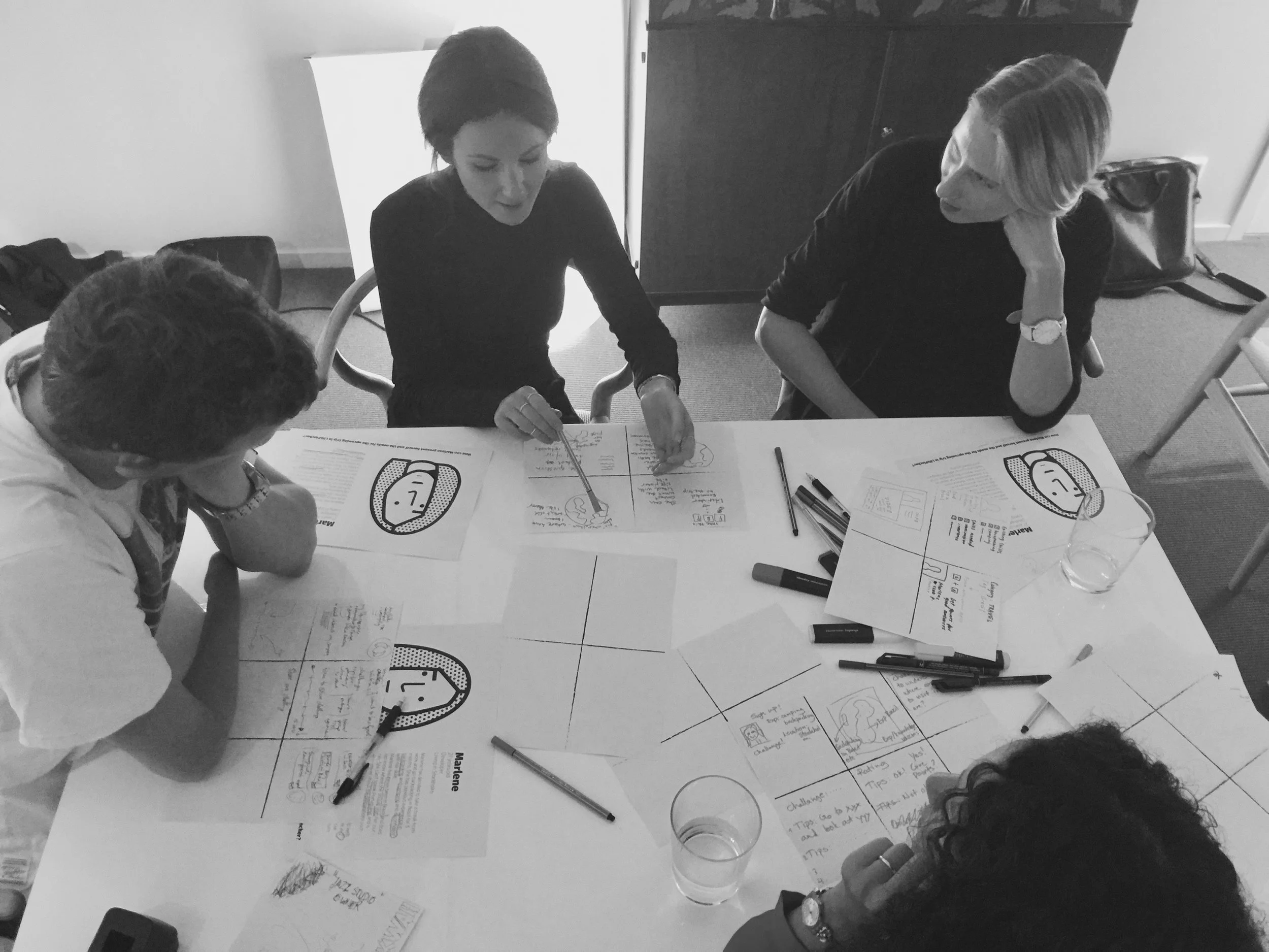
In order to get to know the client and their vision with the product a workshop was organised. Workshopping should be fun to keep the participants engaged and a great chance to get to know the client. I facilitated set of collaborative exercises including drawing and acting to define a common goal for the re-design of BankID products.

Simplifying content through new sitemaps
The multiple web services that BankID provides consisted of varying information hierarchies. Some sites had deep information hierarchies whereas some had broad and shallow making the sites feel unrelated and hard to navigate. The first task was to define what is the most important information to be presented to the users. This was done by writing and prioritising user stories and collaborating with the client in a design workshop. The new sitemaps were created so that they that work in synergy throughout the sites.

Standardising content pages by defining templates
The current services used over 40 different page templates, which add up to the complexity of readability and future development. After the sitemaps were defined the content was analysed and new templates were defined based on the need. As a result the number of templates was halved giving the sites and updated feeling. Creation of a wireframe prototype was started based on the templates.

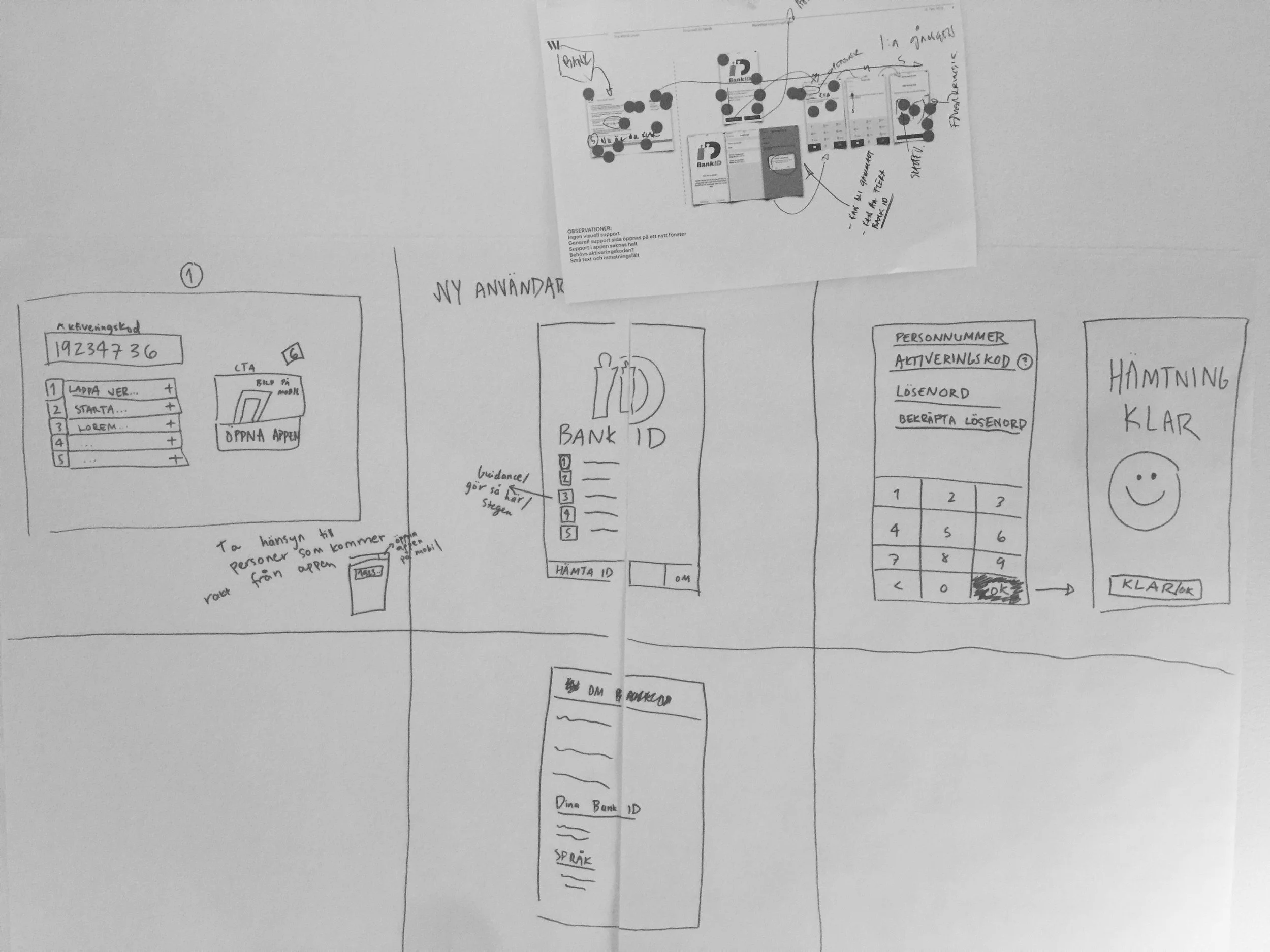
Testing the usability
The clients top priority was to make the on-boarding flow as easy as possible. After a flow had been sketched and prototyped user tests were conducted with interactive wireframes. The tests included users from extreme age groups ensuring that the needs of those who struggle the most are covered.
Handing over an interactive wireframe prototype
My delivery for the project was 4 interactive prototypes that demonstrate the sitemaps, templates and type of content on the sites. I created separate views for both the desktop and mobile views to be hand over to the client and visual design.